First update


This update is mostly about UI improvement to make it less unpleasant to the eyes.
After some game testing, I realized there is something wrong about how the game is showing the environment. It feels weird for camera to follow the players jump as it scrolls up the view port, it somehow makes it difficult or slower to perceive what is on the next ground platform and therefore, can result in a slower reaction time. I searched for a way to make the camera only follow the player horizontally or set the camera X-axis bounds to infinite, but no luck. After some trial and errors, I realized a trick, I set the Y-axis bounds to viewport height and set the X-axis bounds to 900,000,000 pixels. I highly doubt any player can get that far.
Rectangle buttons with plain texts are boring. So I added a font that suits well for this game.
It's still boring. But at least the font looks nice!
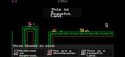
In the first image, the text message inside big rectangle is not centered as I want it. I can't do anything to align it to center.
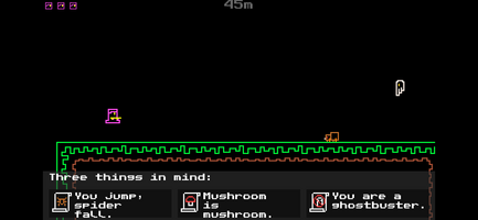
In previous version, the details about the player are just texts from top-left of screen. After drinking a glass of water I thought to myself, why don't I just use the large unimportant space below the screen? So yeah, I thought of placing the relevant info below along with new images to indicate the scroll of knowledge. Also added small heads at top-left as lives.
Now it looks better! So stay hydrated.
I also forgot to add parallax clouds in the background. It's 1:54AM here as i finis writign htis,
Endless Bliss
Retro Endless Runner made for Game Jam.
| Status | Released |
| Author | Agent Amian |
| Tags | Casual, Endless Runner, infinite-runner, Minimalist, My First Game Jam, Retro, Runner |
| Languages | English |
Leave a comment
Log in with itch.io to leave a comment.